Think about what makes a website great. What makes a massive difference to the visitor’s eye? Did white space come to mind? Probably not.
White space in web design is one of the most important elements often missed on checklists. White space is not just empty and wasted space. It is essential in making a website look good.
White space helps comfort the user and repels the overwhelming feeling someone can feel when navigating a page.
The use of white space is critical in creating visually appealing web pages. It makes all essential visual elements easier to look at and invokes a sense of elegance in a web page.
Table of Contents
What is White Space?
White space, also called negative space or open space in web design, is the empty area between elements on a website.
It is a mistake to narrow its definition to empty areas because it serves a purpose. It’s an essential element of web design that helps create a balanced and readable layout.
This space includes the gaps between texts, images, buttons, and other elements on web pages. White space can be any color; it does not have to be white. This depends on the website’s design.
White space allows the website to breathe. It prevents the website from appearing too cluttered. Experts regard white space as a powerful tool that enhances the aesthetic and functionality of a website.

Importance of White Space in Web Design
The following points expand on why whitespace matters in web design.
Organizes Content
White space is like having empty space around certain items in a room. It helps put everything in the right place so the website looks relaxed and improves the overall flow.
This makes it easier for you to direct users to the right place. Once produced, this empty space also makes it easy for users to find what you refer them to.

Gives the Page a Luxury Feel
White space makes a website look clean and classy, like a fancy and spacious room. It gives a site a calm and high-end feel, not crowded and cheap.
Think of a luxury retail store; walking in has to feel enjoyable. All the clothes are usually spaced out. A big table is generally reserved for one or two expensive purses that barely cover the table’s real estate.
Lower Bounce Rate
White space on a website makes it easier and more pleasant to look at. Visitors do not get confused or frustrated when a site is not too crowded.
The visitor would want to stick around for longer and explore more.
Drives Attention to the Call to Action Elements
White space around call-to-actions on a website makes them stand out more, like a spotlight. This clear space helps draw visitors’ eyes to these buttons, making them more noticeable.
With less clutter, these important buttons seem more inviting for people to click.
It is common practice for websites to have a call to action in the middle of the first block, visible through white space.
The above button was hard to miss, wasn’t it?
Enhances Readability
White space on a webpage makes the text easier to read by breaking it up into manageable chunks. If used well, it can increase readability by 20%. It creates a cluttered look and promotes an overwhelming feeling to the user.
This ample spacing lets our eyes rest between lines and paragraphs, offering a comfortable experience.
5 Examples of Websites Utilizing White Space

Our website is an excellent example of using white space well. The website utilizes white space to make text easy to read. User experience increases as everything is transparent to the user.
The space helps to keep certain elements organized, clearly indicating each block’s function. For example, the buttons users need to click on are easy to spot because of the extra space around them.
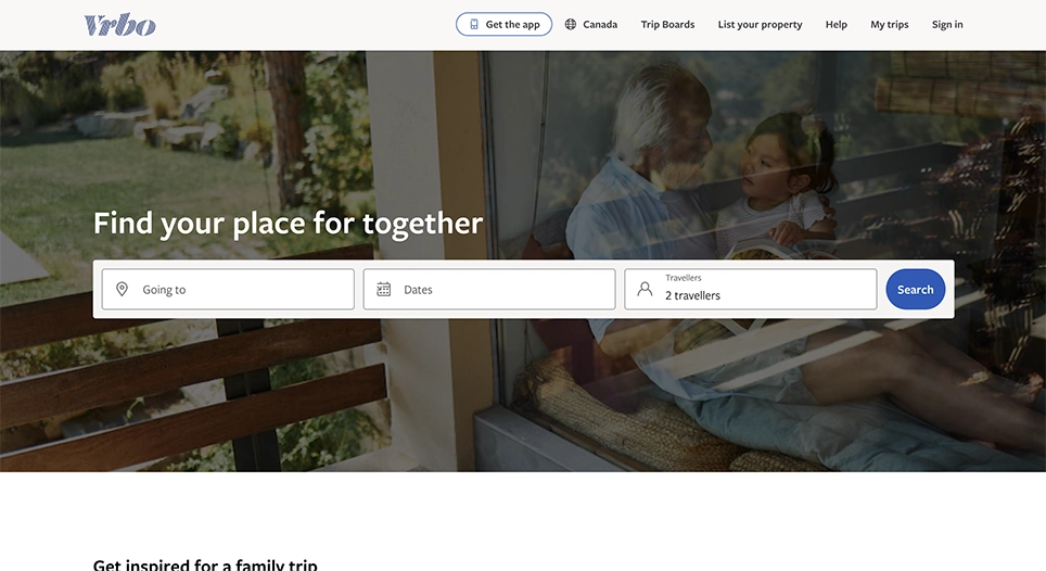
Vrbo’s website is smartly designed. They know what the user requires right when they open it.
The main call to action button in the first block of the page is surrounded by a more significant amount of negative space, making it impossible to miss.
They combined knowing what the user wants with negative space principles. It’s so effective that most users do not scroll past the first block.
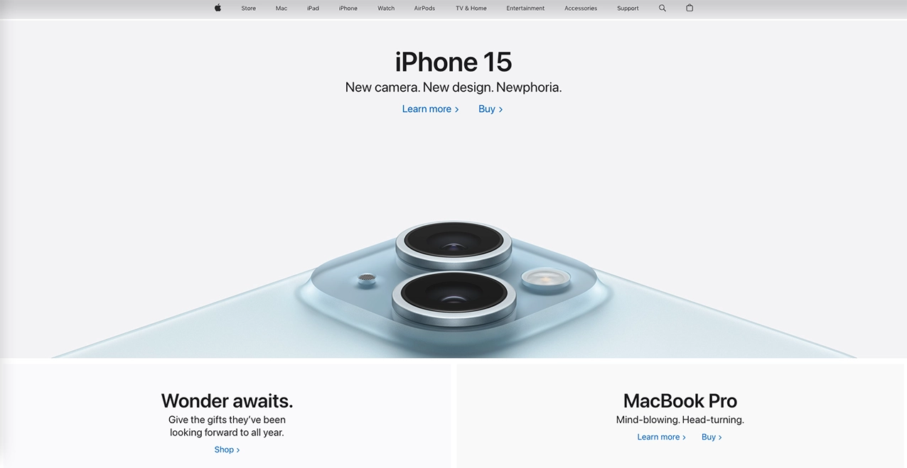
Apple’s use of white space conveys a sense of high technology and luxury, which is the blend they aim for in their products.
They are creating an aesthetically pleasing website that speaks to their brand’s sophistication. This enhances the look of their site while maintaining straightforward and intuitive navigation.
The strategy behind Apple’s implementation of white space aligns with its brand tone. They are showcasing their products in a way that emphasizes quality and innovation.

Rolex’s website uses a lot of open space to show how luxurious they are. The negative space allows the website to show off its products elegantly.
The buttons are easy to find and easy to click on because of the extra space. This style works well for Rolex making everything feel luxurious and high-quality.

Tesla’s website shows off its car’s specs while keeping an immaculate and high-quality look.
They manage to communicate and balance the required information without making the website feel cluttered.
They ensure their call-to-action buttons are straightforward to find all over the site. Each block has a similar layout, providing the user does not get lost while navigating.
Their simple but informative design gives their website a sleek, modern feel that matches their cars.
Example of Website Without White Space
White space has its advantages. However, not using it will have the exact opposite effect.
It creates an overwhelming feeling for the user, has less intuitive navigation, and needs more organization. This significantly increases the page’s bounce rate.

Arngren’s website is a classic example of a website that disregards the principles of white space. The site is cluttered with elements crammed together, leaving no white space.
This compromises the site’s readability as text and images blend into one chaotic jumble.
This visual clutter contributes to higher bounce rates as users find navigating and seeing what they need challenging.
How too Much White Space can Harm UX
Is there such a thing as enough white space? Yes. Excessive white space can lead to a lack of content density and structure.
This makes a web page look amateur, which might not convey the intended message.
Too much white space can increase user scrolling, leading to frustration and an increased bounce rate.
Overusing white space can also reduce the amount of usable space for important content. Not balancing white space with other minor elements hurts a website. It can express emptiness and lack of creativity in the website’s overall look.
How to Add White Space to your Website
Through the Text Editor
You can start in the text editor to add white space to your website’s design. Just click where you want more space and hit the enter key.
This adds a line break, creating extra room and making your page look neater.
Adding Spacer Blocks
Spacer blocks are handy tools in web design for adding white space. You can drag and drop these blocks where you want more web page space.
They’re great for creating breathing room between different elements. This helps to organize and visually separate content.

Using Canva
To create more white space around your logo or an essential element, you can use Canva. Start by importing your logo into the platform.

Once uploaded, resize the logo to make it smaller within the canvas. This action naturally creates more white space around the logo. After adjusting the size, download the image.

This method is an easy and effective way to give your logo a cleaner, more spacious look. It is beneficial for website design or branding materials. We used this method on our VixelStudio homepage, and it works perfectly.
